Interactive & Multimedia Learning

Category: edci337–blog

Weekly Blog Post 7

The Personalization of Learning

Through this week’s study, I have learned a lot of new knowledge about artificial intelligence and other technological tools to help personalize learning.

The use of AI technology in personalized learning is a good demonstration of the critical points of personalized learning. Based on data analysis, AI can accurately analyze the current situation of students to develop a set of personalized learning programs for different students, timely consolidation of learning, and more efficient mastery of knowledge points, and improve the overall efficiency of teaching.

figure 1. Duolingo welcome page.

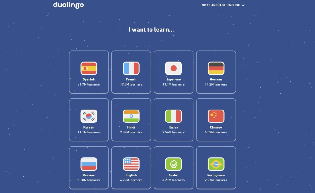
I used Duolingo for a while to learn Japanese, which was an excellent experience. Duolingo’s bot uses sound recognition technology to determine if my pronunciation is accurate. It can also translate complex sentences into sounds, which is more efficient than when I was learning English earlier in my life by simply familiarizing myself with the language through textbooks, TV shows, and movies. It also adjusts the pace of the course based on feedback, correcting the program’s judgment of my level by the length of time I spend answering questions and the percentage of questions I get correct so that it can create a more appropriate learning plan. Historically, some rich people would invite teachers to give their children one-on-one personalized instruction. But now, with the spread of AI technology, ordinary people can also get personalized education through a vast Internet database.
Personalized instruction through AI is prevalent today. I can even find similar applications in video games, such as the Nintendo Ring Fit Adventure, a fitness video game. It uses time use in each workout, the results I complete, and the change in my heart rate to modify my workout plan for the next day.

Weekly Blog Post 5

Instructional Design and Lesson Planning

After reading and understanding Merrill’s principles this week, I agree with him that “Learning is promoted when learners are required to use their new knowledge or skills to solve problems” in the context of my personal learning experience. When I apply my new knowledge directly, I deepen my understanding of that knowledge.

In conjunction with Merrill’s principles, I tried to design a course on how meanders are formed in geography.

Big Idea    What is the big idea that the learner will walk away with at the end of the lesson that is critical for learners at this stage of their learning path?Learning Outcome(s) What specific things will the learner know or be able to do by the end of the lesson?Evidence of Learning What does learning look like for this objective? (e.g., accurate performance of a task, correct use of terminology)Assessments What will learners do to provide evidence of their learning? (e.g., a presentation, a test, a project)Learning Activities What learning activities will allow learners to acquire and practice the skills necessary to demonstrate their learning and complete the assessment successfully?
Through this course, learners will gain a clear understanding of how meander are formed.  The learner will be able to clearly depict and describe how meander and Oxbow Lake are formed in a river system.A fast forward video will show the formation and changes of a meander The details of the formation process will be analyzed with animations. Finally, a reduced model will be used to show a simulated meander. Learners can also use this model to practice their understanding.Learners need to draw sketches to show the different stages of the meander formation process.Distinguish meander and Oxbow Lake from an overhead map. Learners can use the model to show others how the meander is formed.
table 1. Meander course plan

The biggest problem in designing a course is finding a way for learners to practice and deepen their knowledge. I finally found a sand-based model that could be used to simulate various river geographies.

Far right) Amanda Cox, Ph.D., director of the newly launched WATER Institute, works with students examining a water flow model.
figure1. river model

Reference

Greenwood, J. Merrill’s first principles of instruction.
https://www.james-greenwood.com/instructional-design/toolkit/merrill/#:~:text=The%20premise%20of%20Merrill%E2%80%99s%20first%20principles%20of%20instruction,principles%20are%20necessary%20for%20effective%20and%20efficient%20instruction.%E2%80%9D%28p44%29

Merrill, M. D. (2002). First Principles of Instruction. ETR&D, 50, 3. pp. 43-59.

Weekly Blog Post 4

Design Principles for Multimedia Presentations

Figure 1, infographic of Benefits of Electric Car

I designed an infographic about the benefits of electric car. On the way to using Canva, I felt that there were too many elements of the site that I wanted to use that needed to be paid for. On the other side, the design process was challenging to balance the complexity of the information. I tried to avoid overly complex compositions that would cause visual stress to the viewer and ended up with a relatively simple design. Following the Design principle “Use hierarchy to help focus your design” and signaling principle , I tried to use to make the critical information more prominent.

After reading the article “The World’s Worst Powerpoint Presentations”, I found out that their bad slides are overly complicated or have confusing guidance for the audience.

For example, in the “The Endless “Summary”, they are writing a whole article instead of a short text for the PowerPoint. Such a slide is entirely useless; the audience will ignore the long text in the presentation slide, and a large amount of text for the presenter does not help spot the slide’s key point. This example is a clear violation of the segmenting principle.

References

Mayer, R. E. (Ed.). (2014). Principles for Reducing Extraneous Processing in Multimedia Learning, from The Cambridge Handbook of Multimedia Learning (2nd ed.). Cambridge University Press

Purewal, Sarah J. Top 10 world’s worst PowerPoint presentations.
https://www.pcworld.idg.com.au/slideshow/366369/world-worst-powerpoint-presentations/

Adobe Express. (2020). 8 basic design principles to help you make awesome graphics.
https://www.adobe.com/express/learn/blog/8-basic-design-principles-to-help-you-create-better-graphics#design-principle-1-focus-on-alignment

Donaghy, Tim. (2021). 8 reasons why we need to phase out the fossil fuel industry.
https://www.greenpeace.org/usa/research/8-reasons-why-we-need-to-phase-out-the-fossil-fuel-industry/

Weekly Blog Post 3

Accessibility and Equity

In this mobile Internet era, we always hear about new products with new features, and Internet software companies focus on promoting and marketing the core features of their products. And often forget about the difficulties of accessibility and Equity of software for the disadvantaged minority.

As far as I can remember, the Apple Accessibility feature is the first time I’ve heard of a significant commercial company designing software specifically for people with disabilities. Apple has designed a particular interaction logic for visually challenged users. The phone’s system automatically recognizes words on the interface, convert the text to speech to guide the user through the process, and reads out the function of the corresponding button when the user taps it.

Figure 1. Apple Accessibility

Another example is Microsoft’s Xbox Adaptive Controller. This device is designed for users with finger difficulties. It fully understands the user’s difficulties and enlarges all the buttons so that users with disabilities can play easily.

Figure 2. Xbox Adaptive Controller

The WAVE plugin suggests that my blog has very low contrast regarding post dates and publishers. After my observation, the corresponding text is thin and gray, which does make it difficult for users with visual difficulties. I want to find a way to change the font and color on the page.

Figure 3. The Persona Spectrum for difficulty

I believe that inclusive design is not only about the needs of the average user but also about considering the needs of marginalized groups. Human beings are diverse, and we all have permanent or temporary difficulties to some extent. For example, I am very nearsighted, and often I need to enlarge the font on the interface or adjust the screen to a color temperature close to the ambient light to make my eyes feel better. Designers can’t expect users to be perfectly sound people who are dedicated to using your product. Inclusive design is a way of caring for a particular group of people and a responsibility to society.

References

Microsoft(2016). Inclusive toolkit manual.
https://www.microsoft.com/design/inclusive/

Apple(2021). Apple previews powerful software updates designed for people with disabilities.
https://www.apple.com/ca/newsroom/2021/05/apple-previews-powerful-software-updates-designed-for-people-with-disabilities/

Techeblog(2018). Xbox Adaptive Controller is an Innovative Input Device for Gamers with Disabilities. Here’s a First Look.
https://www.techeblog.com/xbox-adaptive-controller-is-an-innovative-input-device-for-gamers-with-disabilities-heres-a-first-look/

Weekly Blog Post 2

How Do We Learn?

During this week of study, I found Mayer’s theory of Contiguity Principles to be the most intuitive for me. As a student, I always try to find more efficient learning methods. When I encounter diagrams or images in the learning process, I want them to be well organized rather than a way that I need to spend more time looking at them to understand them.


On the other hand, I sincerely appreciate the redundancy principle in describing examples. When creating slides or copy, I strive for perfection or refinement, which can lead to repetition or unimportant extra content. This kind of behavior puts extra pressure and load on the reader.

I have a hobby of building websites. In UI design, I often make it too complex and repetitive, which can create visual clutter. Sometimes the reason for over-design is that I try to anticipate new features that may be needed in the future. In fact, this concern for future needs creates unnecessary redundancy in the existing design. As a result, I was occasionally forced to use free templates to solve this website design problem.

In the week 2 Read/Watch study, the four videos illustrating Maier’s theory implement the redundancy principle well. They use more graphics and narratives to explain the substance of the corresponding principle while avoiding additional text for repetitive descriptions.

References

Mayer, R. E. (Ed.). (2014). Principles for Reducing Extraneous Processing in Multimedia Learning, from The Cambridge Handbook of Multimedia Learning (2nd ed.). Cambridge University Press

Margot, A (2019). Cognitive psychology in UX design: Minimising the cognitive load.
https://medium.com/@AlesioM/cognitive-psychology-in-ux-minimising-the-cognitive-load-d97ad8e3115b

Weekly Blog Post 1

Introduction to Interactive and Multimedia Learning

As a member of the generation that grew up with the mobile Internet boom, I am used to multimedia in my life. However, I still use the traditional way to learn most of the time. So I look forward to learning how to use interactive multimedia to improve the efficiency and quality of learning in this course.


Interactive media

Traditional messaging software can be considered interactive media that allows users to interact with each other using text.


Multimedia

Film can be considered multimedia. It provides motion pictures and sound information to the user while the movie is playing.


Interactive multimedia

Mixed reality can introduce realistic scene information in a virtual environment. Glasses can be used to show users a virtual 3D image positioned in the real environment, or sensors can be used to identify user coordinates for spatial audio.

Mixed reality systems can interact with users by tracking body movement information and voice input.


There is a certain amount of a gray area in interactive media and multimedia. Nowadays, most interactive products are in the form of plural media. There will be products that are classified as both interactive media and interactive multimedia.

Mixed reality is a technology that allows users to interact with virtual and real environments at the same time.
In particular, the global pandemic of the past few years has created a massive demand for remote work and learning. I think the use of virtual reality and mixed reality technologies in remote collaboration will significantly enhance efficiency and ease of communication.

References

Microsoft (2022). What is mixed reality?
https://learn.microsoft.com/en-ca/windows/mixed-reality/discover/mixed-reality

Dhir, R (2021). Interactive Media.
https://www.investopedia.com/terms/i/interactive-media.asp

© 2025 Xinyi EDCI

Theme by Anders NorenUp ↑