Design Principles for Multimedia Presentations
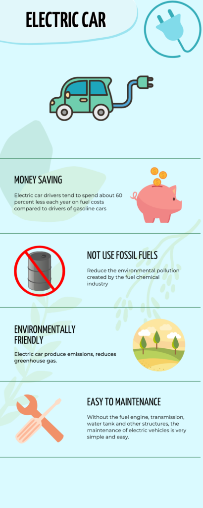
I designed an infographic about the benefits of electric car. On the way to using Canva, I felt that there were too many elements of the site that I wanted to use that needed to be paid for. On the other side, the design process was challenging to balance the complexity of the information. I tried to avoid overly complex compositions that would cause visual stress to the viewer and ended up with a relatively simple design. Following the Design principle “Use hierarchy to help focus your design” and signaling principle , I tried to use to make the critical information more prominent.
After reading the article “The World’s Worst Powerpoint Presentations”, I found out that their bad slides are overly complicated or have confusing guidance for the audience.
For example, in the “The Endless “Summary”, they are writing a whole article instead of a short text for the PowerPoint. Such a slide is entirely useless; the audience will ignore the long text in the presentation slide, and a large amount of text for the presenter does not help spot the slide’s key point. This example is a clear violation of the segmenting principle.
References
Mayer, R. E. (Ed.). (2014). Principles for Reducing Extraneous Processing in Multimedia Learning, from The Cambridge Handbook of Multimedia Learning (2nd ed.). Cambridge University Press
Purewal, Sarah J. Top 10 world’s worst PowerPoint presentations.
https://www.pcworld.idg.com.au/slideshow/366369/world-worst-powerpoint-presentations/
Adobe Express. (2020). 8 basic design principles to help you make awesome graphics.
https://www.adobe.com/express/learn/blog/8-basic-design-principles-to-help-you-create-better-graphics#design-principle-1-focus-on-alignment
Donaghy, Tim. (2021). 8 reasons why we need to phase out the fossil fuel industry.
https://www.greenpeace.org/usa/research/8-reasons-why-we-need-to-phase-out-the-fossil-fuel-industry/
Leave a Reply
You must be logged in to post a comment.